Increasing Conversions for a $250M eCommerce Brand

Case study

Conversion Rate Optimization

Case study
TOOLS USED
The brand (name withheld because of NDA) had seen rapid growth since its launch. They were running successful email marketing and Google Ads campaigns to drive a reasonable number of qualified visitors to their website, but they suspected the site was underperforming when it came to conversions. For example, only about a quarter of all product page views resulted in an add to cart. Was there really a problem and could Northpeak’s CRO team help the company add a few more millions to their bottom lines?
At a time when other online businesses were basking in double-digit growth, was an underoptimized experience impacting performance? That’s when the experts from Northpeak stepped in.
Client
The company is a growing wellness and lifestyle eCommerce brand worth over $250 million. Their main channels for customer acquisition include paid search, email and social. They are tech-savvy and were already testing and optimizing campaigns when they met us
Problem
The growing brand was running paid search and social, testing emails for further optimization. They were in the process of updating their data and processes. The biggest challenges in executing an in-house conversion optimization program were limited tech bandwidth and incomplete data.
Solution
We decided to focus on delivering high impact and quick wins that wouldn’t take up significant development resources, but will improve conversions throughout the site and help us reach our goal of increasing revenue with the existing traffic levels.
Goal
We were not sure where the problem was, so we decided to develop testing hypotheses that would increase the conversion rate for:
1. Purchases,
2. Add to carts,
3. Product page views
Key questions we needed to answer
1. Do we have accurate tracking in place to analyze customer touch points?
2. What is the analytics health of key pages?
3. How can we increase motivation and relevancy?
4. What things are causing the biggest friction and how do we reduce it?
5. Where are the weak spots in the user experience?
Methods
1. Tracking Assessment
2. Funnel Analysis
3. User Journey Analysis
Process
Since they were already optimizing email, their largest revenue driver, we decided to focus on Organic, their main channel from a traffic perspective.
1) Tracking Assessment: We first did a deep dive of current tracking and realized there were key elements not being tracked in GA 360. We decided to combine the available data from Google Analytics with the data from Amplitude to understand user behavior and fill in some of the crucial missing gaps.
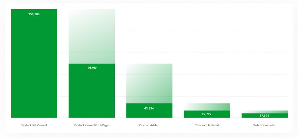
2) Funnel Analysis: In order to focus on quick wins that wouldn’t take a lot of development resources, we wanted to understand the conversion funnel closest to purchases for desktop and mobile. This would require us to look more closely on the PDP and PCP pages.
We discovered that the biggest drop off point for desktop were the product pages—only 24% of all product page views ended up with an add to cart.
product-list-pepefziunkltdw9119bgyskgf1lqesad88l82l9vnc78
Given this, we focused our hypotheses on the main drop off point in the funnel—product pages, followed by the second largest drop off point—category pages, and the 3rd point —the cart page.
We went through a similar analysis for mobile PDP and PCP pages. The next step was to analyze user journeys.
3) User Journeys We wanted to uncover the differences in behavior between users who ended up making a purchase and those who didn’t. The idea was to find out if we could influence the buying behavior and nudge more people towards a purchase.
This required a multi-step approach:
1. Identify, gather, and segment the correct data;
2. Analyze the behavior at different touchpoints;
3. Figure out why certain users make some choices and what can we do to nudge them onto a conversion path.
To tackle the first step of this approach, we created the following framework:
1. Analyze the main pathways to shopping intent
2. Analyze what happens from shopping intent to purchase completion
3. Segment these purchase paths by device and correlate successful pathway completion to user experience. This step would help identify leading drivers of success and compare them to unsuccessful behavior to extract insights.

We analyzed the following user experiences broken down by device (desktop vs mobile) and by step completion (step conversion vs drop-off):

1. Product List Viewed to Product Viewed – covers experience from starting shopping experience to shopping intent

2. Article Viewed to Product Added – covers browsing experience to purchase intent

3. Product Viewed to Order Completed – covers experience from shopping intent to
purchase completion

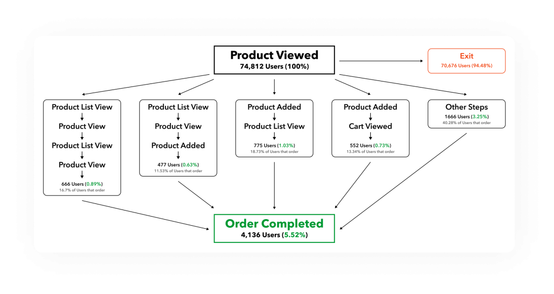
Below is an example of a Product Viewed to Order Completed customer journey on mobile for users who converted. The actual paths were complex and varied significantly so we had to consolidate into the main pathways.
product view
We first looked at the customer journey for mobile users who dropped off. Then, we compared this step to the desktop experience.
Learnings from the Mobile Customer Journey Mapping
The product page is the last page most users see before they exit the website. Close to 47% of all mobile users are not taking any additional action and just drop off from the funnel. Moreover, 15.59% of users are going back to a category page and then leaving. We’ve also discovered that a third of all users who add a product to their cart continue down the funnel and complete a purchase. Based on this data we focused our hypotheses towards increasing the number of people that add a product to their cart from the product page, thus increasing the number of conversions by keeping users engaged throughout the funnel.
Overall, 5.52% of all users on mobile that see a product page end up converting and making a purchase. This raised a flag since it was 50% less than the desktop experience.
Importantly, we noticed that some desktop users go directly to checkout once they add a product, which is not the case for mobile users who prefer to check their cart before they initiate the checkout. We learned that this behavior was linked with the mobile modal popup and the fact the popup was being rendered outside of the viewport when users clicked to add a product to their cart!
Example Hypotheses and Tests for improving mobile add to carts

After going through a thorough process of qualitative and quantitative analyses, we generated 13 high priority improvements or tests.

Below are examples of our recommendations specifically for improving mobile add to carts conversion rates.

Example Hypothesis #1

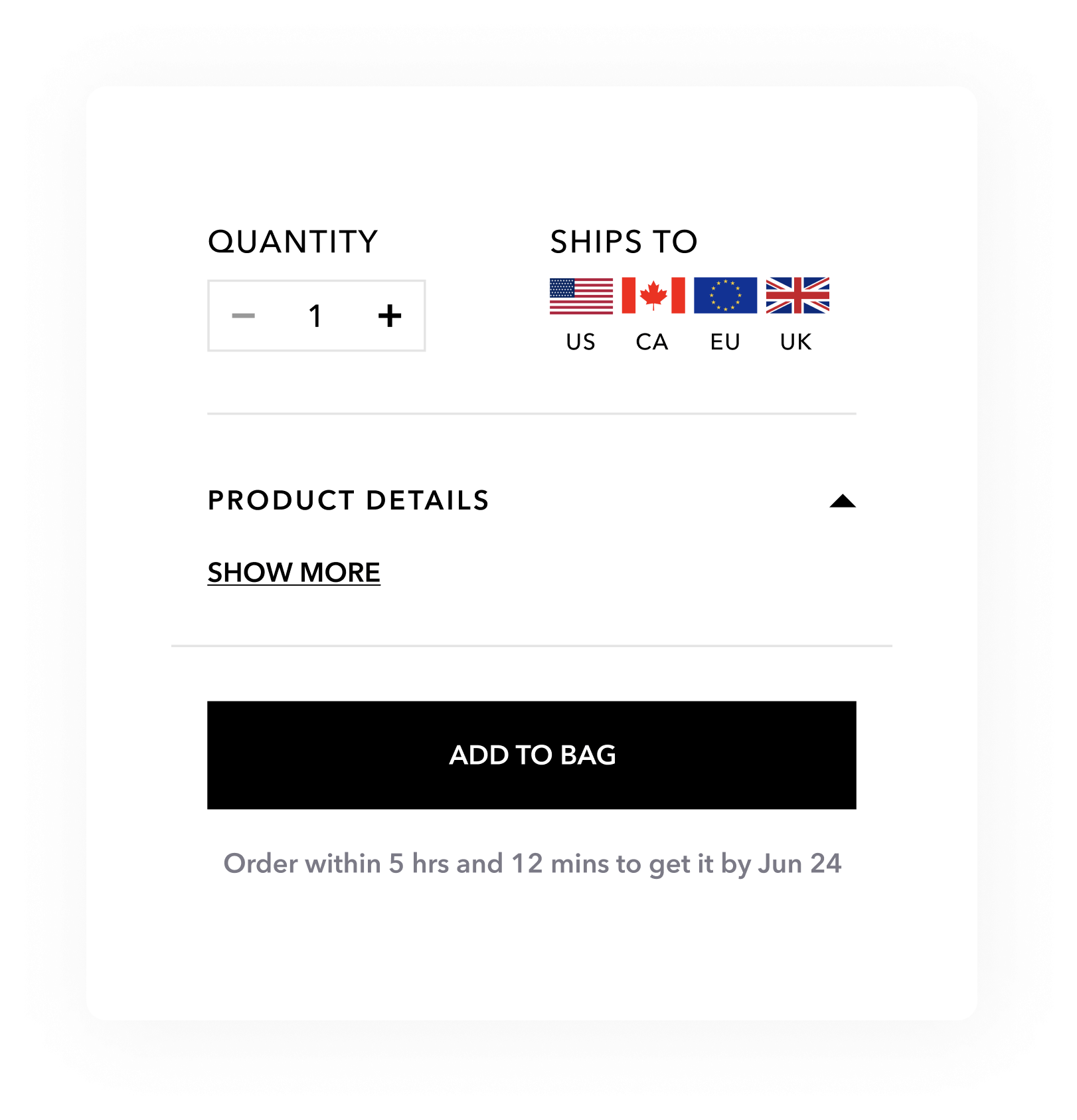
Problem Statement: There is no estimated shipping time from order time on product pages which can prohibit users from placing an order.

Solution: Add a shipment time estimation right below the “Add to Bag” button to increase urgency.

Goal: Increase “Add to Bag” button clicks
exanple_img
Example Hypothesis #2

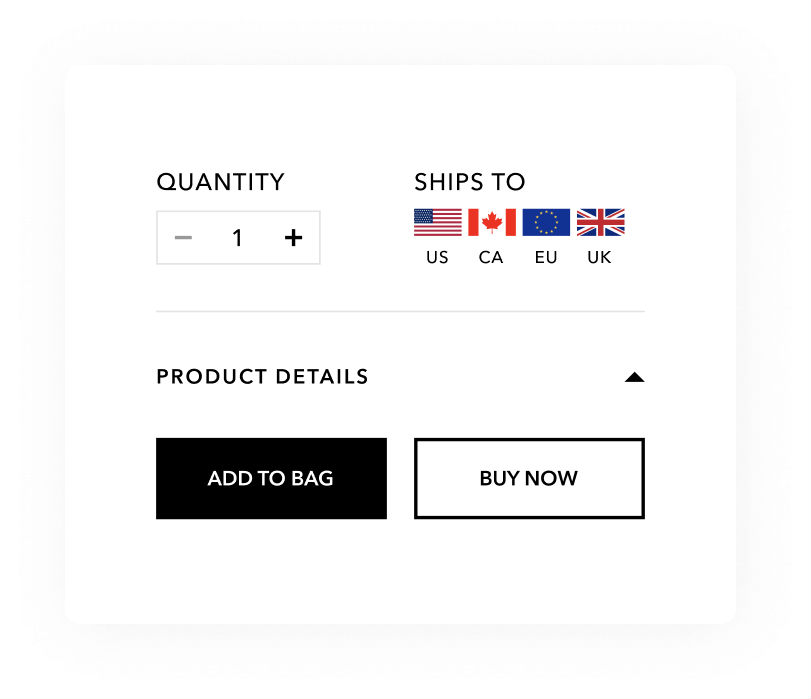
Problem: Once a user adds a product to their bag they have to visit the cart page or click another button to go to checkout, which is an extra step in the funnel that can be shortened.

Solution: Add a “Buy Now” button besides the “Add to bag”.

Goal: Increase Conversion Rate
exanple2
Example Hypothesis #3
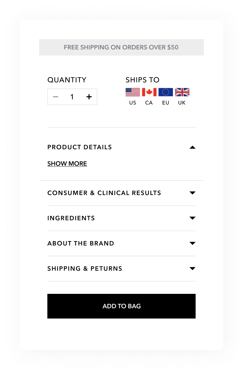
Problem: Even though the company offers free shipping on orders over $50, the offer is only mentioned via a badge placed right under the product title, which most users scroll past.
Solution: Because free shipping is a proven tactic for increasing conversions in ecommerce, adding a sticky bar that the user can see during their entire session time while they analyze a product can increase “Add to bag” clicks.
Goal: Increase “Add to Bag” button clicks.
exanple3
Results
Due to confidentiality agreements we are not able to share results at this time. Please contact us to learn more.
Results

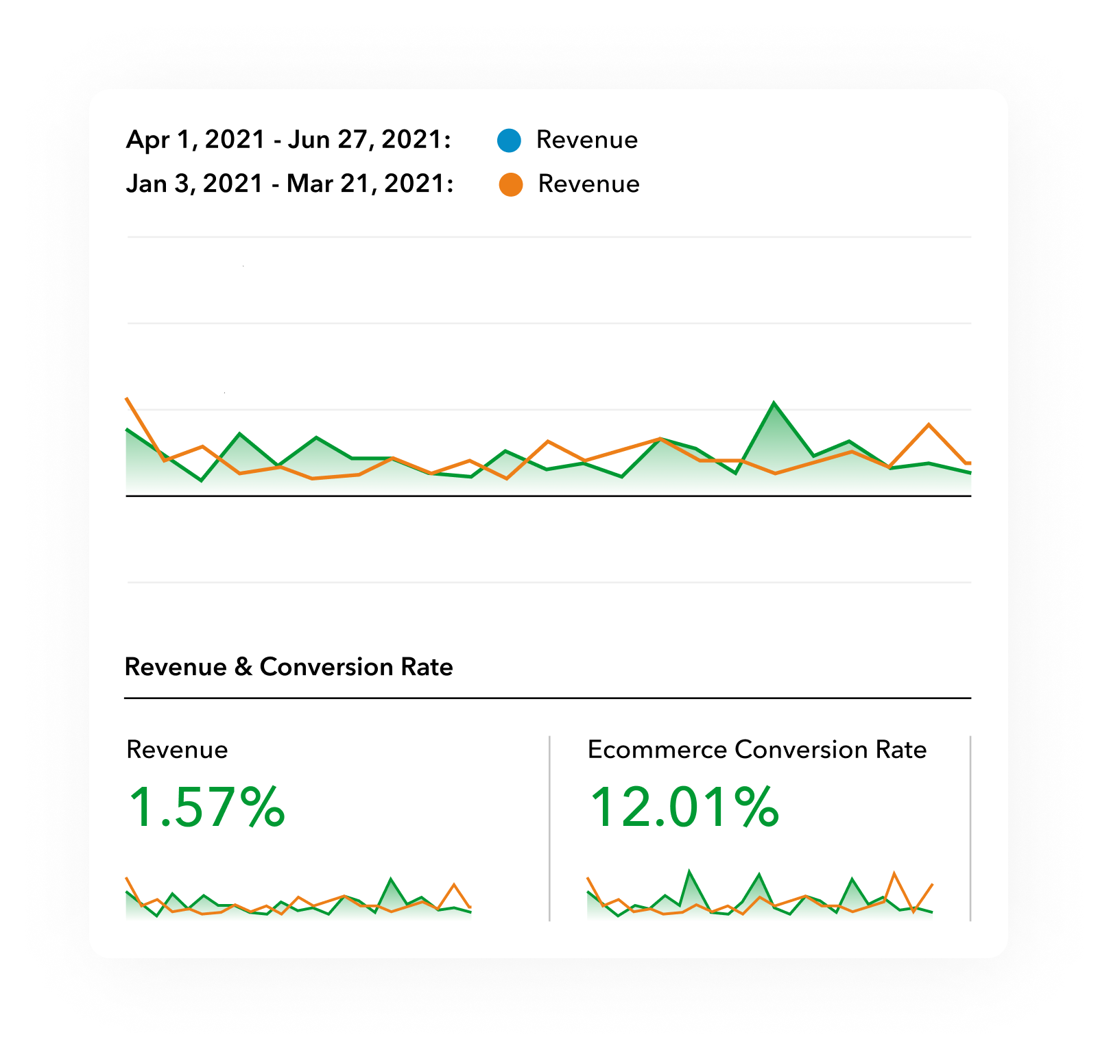
At the time of writing, our quick-win CRO tactics have delivered a ~12% increase in conversion rate, which translates into a 1.57% increase in revenue quarter over quarter.
 

If you’re looking for a proven CRO partner for your eCommerce brand, schedule a call with our team to discover how we can help you stop wasting traffic and start converting more visitors into buyers.

If you’re looking for a proven CRO partner for your eCommerce brand, schedule a call with our team to discover how we can help you stop wasting traffic and start converting more visitors into buyers.